
Warhammer tone pro - initial review
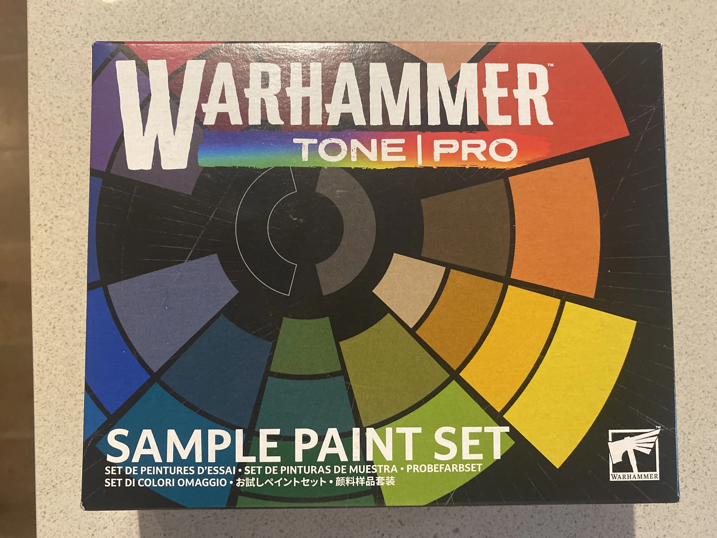
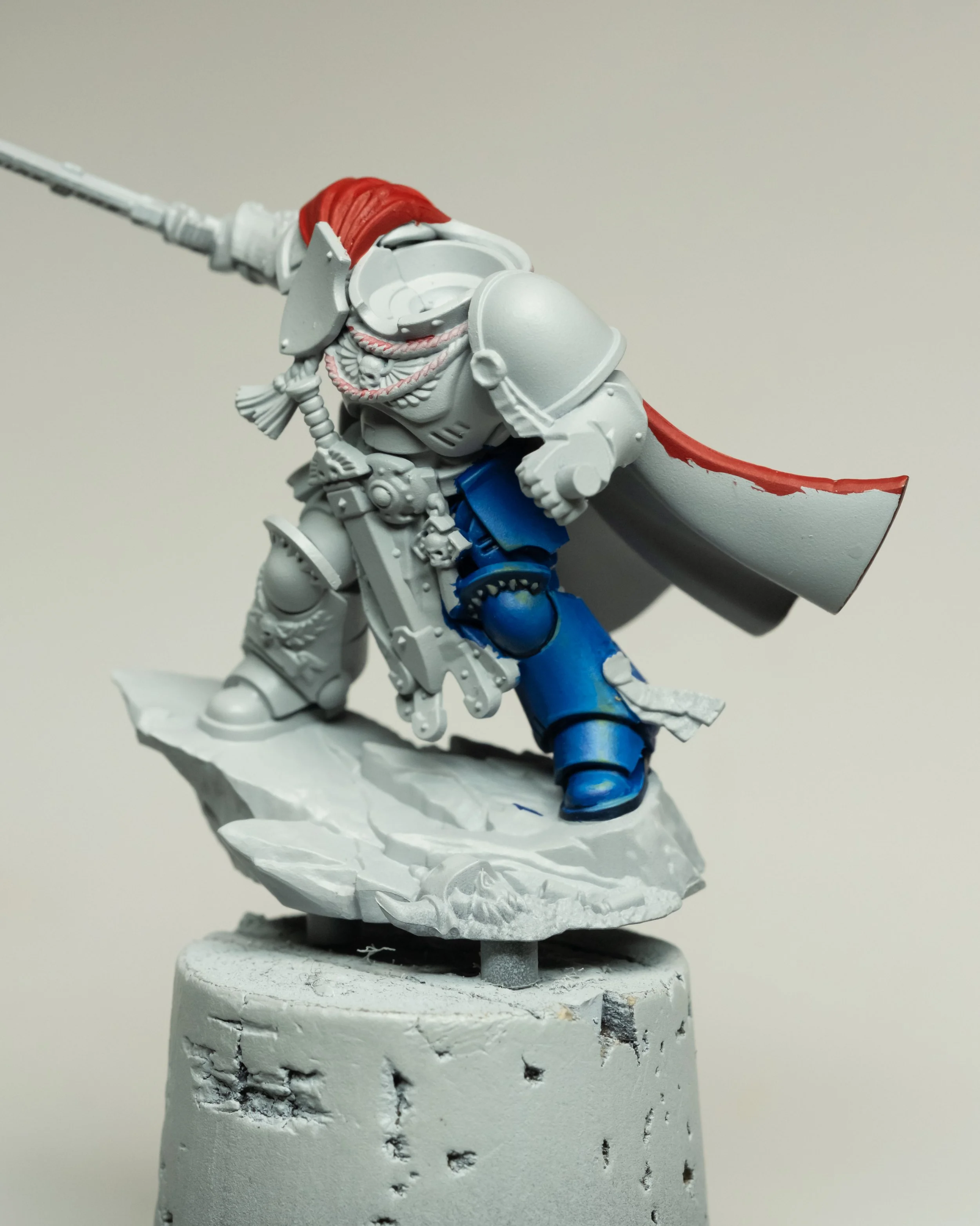
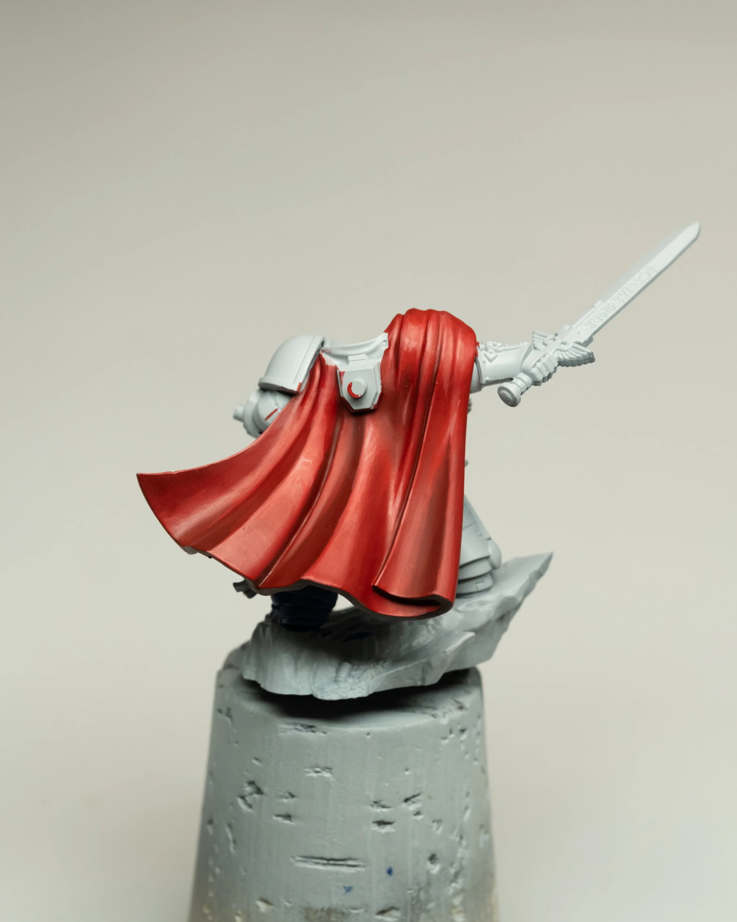
Over on Twitch, I tested out the new Warhammer Tone Pro paints that were sent to me by Games Workshop. This is an initial review with around 3 hours of painting time over the stream which you can watch the VOD here. Be mindful, that for a full conclusive review I’ll be needing a lot more time with the paint to work in the finer points.
My first impression right off the bat is that the opacity of these paints is very strong. They’re a very forgiving medium that offers excellent coverage in a single pass, provided you’re loading the brush properly and applying an even painting stroke across the surface. The finish is much more on the satin side than I’m used to, and the numerical tone system seems to work quite true, as was the case with the blue power armour demonstration. My idea is that this paint will offer access to more difficult colours to work with, as well as a positive stepping stone for newer miniature painters looking to be more involved with the brush, beyond the slap-chop contrast wash approach. It offers a forgiving working medium and a system that can make recipes easier to follow for desired results.
Consistency
All the paints I dropped onto my wet palette, and ran my brush through to load, felt quite liquid and flowed well. Across the various hues of red, blue, yellow, and orange that I tried, the consistency of the medium felt very similar through the brush. This also extends into the numerical tone values within a single hue, with only a slight shift I found in the blue between 3 & 4 (more on those later). The fluidity also has some stickiness to it as well, which feels comparable to the Ionics range. As with water-based acrylics, I was primarily thinning them with water, but I also had their shade medium on hand, and I also put down some Lahmian Medium to see its reactions. I really do wish they’d sent the blending medium to try, as this would suit my painting style much more. Due to the pigment density and opacity these paints offer, I noticed right away that my ratios will have to adjust, and more water will be needed to thin this paint in order to control it when it comes to creating a weaker mark.
Layering up
These paints layer very well, offering predictable coverage that averages around 85–95% on the first pass. The paint stretches quite well and is forgiving across a full paint stroke as it reaches near the end of the loaded charge. One thing to note here is the drying time of these paints: you’ll have to get used to the tempo of painting with these in comparison to other paints. The drying time is slower; therefore, to avoid pilling and fine debris in your paint finish, allowing time for your layers to properly dry before applying further layers is critical for getting a clean finish. This lives up to my painting mantra of “Smooth is slow, slow is fast.” Being used to painting at a certain tempo when building out my initial layer sketch, I had to be mindful of this, as I saw some pilling in the finish—more so on the red cape.
Paint by Numbers
The numbered system is going to be one of those things you either use or throw away and use your eyes. Regardless, I think it’s going to be helpful for people to achieve better value control and make more confident choices when it comes to selecting paints. It works quite well, and I’ve adopted it in how I approach volumes.
Starting with No. 1 in Blue Gorkshroom to paint into all the shadows, then following with No. 3 to fill in all the light areas, and then using No. 2 as a halftone to transition the shape from shadow into light. These three tones, given that they are blue and in the darker/cooler half of the colour wheel, matched out really nicely and gave a good blended progression just with straight layers alone—no actual blending, further halftones, or feathering/glazing, etc. (More on that a little further down.) The jump was most noticeable transitioning from No. 3 into 4. When all five tones were laid down, this area was the place that had the largest jump in value. I can’t expect every tone to be spaced perfectly, but it’s good to set expectations and be ready to whip out your preferred blending techniques if you’re like me and want to push the finish like a PRO.
Mixing & Blending
Adjusting to the weight of the pigmentation and strong opacity does make it trickier to adapt my painting approach to blending. With the initial layers down, mixing further halftones to be placed between steps was a bit trickier at the start. This is just due to controlling the consistency of the paint itself, needing more water and/or Lahmian Medium. An interesting note: with the Lahmian Medium, the drawbacks of using too much with other paint brands and creating a satin finish don’t apply here, as the paints themselves are a bit too satin for my personal taste. When a paint is too satin, I have more difficulty seeing where I’ve actually painted; instead, I have to put more trust in what I have mixed on the palette and in the brush, and then, when applying the halftones, look at the “wet” areas to see where I’ve painted. The reflective shine coming off a satin paint makes it harder to see what’s going on, requiring me to move the model around more so my lamp’s reflection doesn’t interfere. Thinning the paint, along with charge and brush pressure, is naturally going to take some more adjustment, but even while painting I was able to tailor this in response.
When mixing one hue into another—in the case of the blue, taking No. 5 and mixing it with the yellow Khemri Sands—I was really surprised by how much power it has to influence the blue. Initial mixes proved too strong, and I had to scale this back. The mix is a bit muddy, but all of the properties still held up well. I don’t expect these colours to mix with the more pleasant behaviours of single-pigment paints such as Kimera or Golden, etc.
Putting the colours into a glaze consistency to perform tints will take some more finesse, again just due to the opacity and strength these paints offer. By no means is it not possible, but you may find the tolerance on the lower end.
First session conclusions
Overall, I would rate this paint up there with many of its advantages right out of the pot and with no thinning, if you want to get your layers down. Will I see the need in my work to get the full tone range? I don’t think it’s necessary, as I really enjoy mixing my own colours in the process of painting. For painters who aren’t completely new to mixing paints, want to use the tone number system, and want to avoid overloading the desk with paint pots, I would broadly suggest going in with numbers 1, 3, and 5—cutting the 2 and 4—and mixing those halftone values yourself.
As a final note with the numbers, painters should note that these values are only a measure within the bracket of their own tone. Unlike the Munsell Value system I use to gauge light value across the entire painting as a whole (in the range of 1–10), don’t assume your No. 5 blue will be equal in light value to a No. 5 in yellow (insert silly GW names).
In a future session, I’d like to see how I can marry this paint with my other paints and mediums. I’m thinking I can lay down a rough foundation sketch, then come back with subsequent finishing passes using paint that’s more manoeuvrable in gentle situations as I approach the highlights. Making very soft marks with this paint felt difficult at first, but I think with more time I’ll be able to find its points and manoeuvre well enough.
Would I run out and buy the entire range, well I certainly won’t be swapping my entire Ionic paint rack for these. But I could see the properties of this paint be advantageous especially in those harder colours to work with. I’m looking at those yellows in particular to be very useful. Or if you want to base colour each element easily with maximum flat coverage to shade and highlight afterwards with other paints in your collection. Getting 1 pot of each hue, and going for an average tone value of 3 as a starting point could be excellent way to take advantage of their high coverage power and reducing the satin with a more matt paint.
The paints are very approachable, and Im overall impressed by a painting product from Games Workshop that contains quality.
Happy Painting,
Bb